UX Secrets for Designing a Robot With a Range of Users
Summary
Contents
Brain Corp’s guiding principle is to create autonomous mobile robots that are helpful and fit seamlessly into their environments. While this seems pretty straightforward, it’s more complicated than it sounds. Achieving this goal involves many feats of engineering and design, not the least of which is incorporating a healthy measure of social, behavioral, and cognitive psychology into our user experience (UX). You can read more about Brain Corp’s approach to user experience in The role of UX in robotics.
When it comes to anticipating how people will interact with a robot, it helps to first understand how people interact with each other. Think about two people “negotiating” to pass in a hallway: They show their intent through eye contact, body language, and subtle changes in direction. They also obey cultural norms, allowing each other to maintain personal space (in varying amounts before and during COVID-19).
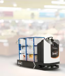
People transfer many of these social norms onto their interactions with robots. A good example is our autonomous delivery tug, a new robotic application for retailers that automates the movement of heavy stock carts from the back warehouse out to store shelves. Tug uses sounds and changes in movement (speed and direction) to let people know its intent from a socially acceptable distance as it negotiates to share aisles with shoppers and store associates, delivering merchandise at the busiest times when it is needed most. While the tug’s form factor – its shape, size, and physical appearance – is new, it hauls a variety of inventory carts that are familiar to retail staff members and shoppers alike.
Identifying users and their unique needs
Creating successful user experiences for this unit at both the software and hardware levels means members of our product design team – myself included – observe and talk to lots of people within the space where the robot will be used. The brick-and-mortar environment in which our tug is deployed has a workflow that involves both the back warehouse and the public area of the store. Thus, the autonomous robot must be helpful and fit seamlessly into environments shared with warehouse staff, sales associates, and the general public as they shop.
Here are some of UX considerations that guide our design:
1. Warehouse staff – These workers lift, move, and haul for a living. They receive large quantities of inventory from delivery trucks and manage the distribution of that inventory to various locations throughout the warehouse area and the retail environment. This user group is also directly responsible for operating the BrainOS-powered tug and regularly interacts with its cloud-connected software. They also oversee what the tug needs to deliver and where.
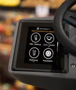
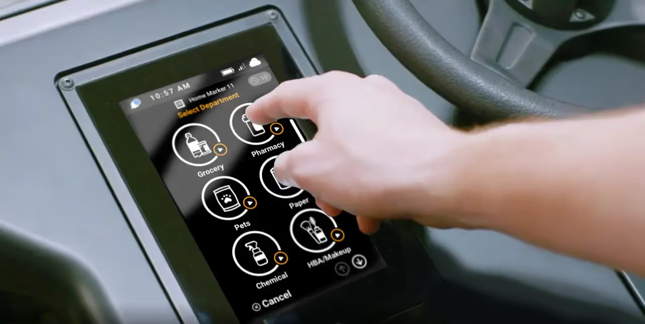
UX considerations: Unlike our floor scrubber robots that generally have only one robot operator, tugs are often used by three or more people each shift, loading merchandise and sending the robot out on delivery runs. In some cases, these staff each have a different preferred language yet must share one user interface (UI). We kept the tug’s UI as easy to operate as possible to cover all the bases. This included creating a glanceable interface (see screenshot) so users always know what’s going on without having to read any text.
Our team also created a cache of simplified icons that the end user taps to select which location to send the self-driving tug next. Brain Corp even asked users to give us feedback on the icons during testing to validate and improve our design. The end result is a very user-friendly interface with customizable departments (beauty, produce, etc.) that takes the guesswork out of moving inventory throughout the front of the store.
2. Retail staff – These workers are regularly pulled in multiple directions, merchandising and restocking shelves, ensuring their departments are in tip-top shape, and answering shoppers’ questions. Add to this enforcing COVID-19 social distancing and mask regulations along with increased sanitation duties, and their plates are officially full.
Traditionally, retail staff have also been tasked with hauling inventory from the warehouse area to the retail floor, dragging carts that weigh upward of 500 pounds, then moving that stock onto the shelves. It’s worth mentioning that many associates don’t like going to the warehouse for a variety of reasons, safety being one of them. The beauty of our robotic tug application is that it eliminates this back-breaking aspect of inventory work, and greatly reduces the time that retail associates are out of their departments. The latter is particularly important during the ongoing pandemic: when shoppers venture out to a brick-and-mortar store, they want to find what they need quickly, and want store employees around to help if needed. When staff are too busy lugging inventory carts around, it reduces their ability to help shoppers, diminishing the in-store experience.
UX considerations: In looking at how this user group operates, we didn’t want to change their workflow, we wanted to upgrade it. To achieve this, we removed a piece of inventory delivery – cart transportation – a necessary yet highly draining task that requires no skill and offers no benefit to the humans performing it. Moreover, hauling large, heavy carts of inventory can lead to on-the-job injuries and worker’s comp claims. The self-driving tug improves safety during inventory delivery and ensures store associates can remain in their departments longer.
For this user group, the glanceable UI is also key: Unlike our route-based autonomous floor scrubbers that autonomously navigate aisles, delivery tugs powered by BrainOS have a department-based icon interface. For staff running around in fast-paced and demanding retail environments, this saves time and confusion because just by looking at the screen, they know where the tug is headed.
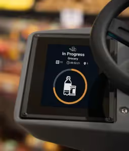
We also included a time indicator on the screen (see screenshot) to show how much longer the tug needs to complete a specific route, so retail staff can plan accordingly. There are also audio cues that make a unique beeping pattern to alert nearby staff that inventory has arrived. Sort of like when a line cook rings a bell to alert busy waitstaff that there’s a food pickup.
3. Shoppers (general public) – Unlike our robotic floor scrubbers, which are often used after hours, the tug is needed for restocking during the day when shelves become depleted. This means it’s in operation during peak shopping times, when the store is full of shoppers. Therefore, during our research phase, shoppers were identified as a significant user group that needed to be understood and accommodated.
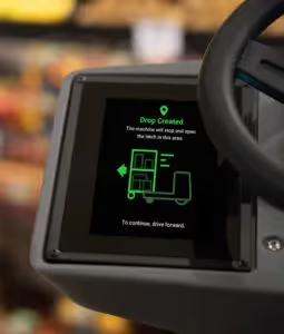
UX considerations: To maintain a comfortable distance between the autonomous tug and bystanders (employees and shoppers), we designed the workflow so that the robot only navigates through wide, major aisles where there is ample room for people to pass by. To avoid blocking traffic in narrower aisles, our tug delivers inventory carts to designated “drop zones” in open areas (see screenshot).
Following social rules, the robotic tug is “mindful” of personal space, responding to the presence of people and showing its intent through sound and changes in movement. What does this look like? It naturally and confidently blends in without being too cautious, and slows down when it gets in close proximity to people in a social space. And of course, our robots wait their turn, stopping and politely giving priority to people when there is no room to pass. BrainOS-enabled robots have designed-in rigorous physical safety precautions at the software, firmware, and hardware levels as discussed in the blog Key Functional Safety Steps for Building Autonomous Mobile Robots. In addition to actually being safe, shoppers need to perceive the robot as behaving safely, which is a big part of Brain Corp’s UX design priorities.
Humans are curious creatures, especially when they are looking at an autonomous robot. That’s why the overall design of the tug gives a sense of what it does (we call this an affordance). By pulling a familiar cart of inventory, it tells bystanders why they are sharing a space with a robot in the first place: it is keeping the shelves stocked for them.
Lastly, our tug has a security feature on the screen so nobody can redirect it without a passcode. This ensures our self-driving tug is operating as it should be so staff stay on task, merchandise gets delivered on time, and shoppers can enjoy fully stocked shelves.
What UX is all about
As you can see, a wide range of people interact with our autonomous delivery tug. Identifying these user groups, understanding their needs, and anticipating their concerns are key to creating successful robotic machines. And that’s what UX is all about.
If you’d like a deeper dive into user experience for robotics, watch The Role of UX in Robotics and Artificial Intelligence from the 2019 Robotics Summit.
For more information on how autonomous mobile robots can support your business goals, contact Brain Corp today.
